From the Toolbox of a Serving Library
2011
This is the final pamphlet in a set of three concerned with art/design education following Towards a Critical Faculty and (Only an Attitude of Orientation)—and so forming the end of a long composite sentence. It was compiled by The Serving Library, which at that time comprised myself, Angie Keefer, and David Reinfurt, and published together with The Banff Centre, where it served as a prospectus for a six-week summer school we ran there the same year.
The idea was to put into practice some of the ideas assembled in the previous two pamphlets via a daily series of seminars that would aim to reconsider what a present-day Foundation Course could or should entail. It is followed by short descriptions of thaat course’s weekly components, each written by that component’s “teacher” (Angie, David and myself, plus Robert Snowden, Anthony Huberman and Dan Fox).
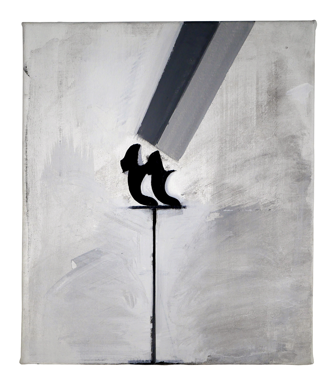
Lead image: Sanya Kantarovsky, The Librarian, 2011, oil on canvas.
*
These are attitudes—but how do they become skills? (Sennett, 2008)
This is the last in a modest trio of pamphlets that consider some past and present models of art/design education in the attempt to forge a new one. The first, Towards a Critical Faculty, was a compendium of both familiar and obscure fragments of arts-educational intent from across the 20th century, while the second, (Only an Attitude of Orientation), proposed a number of “working principles”—attitudes—that a contemporary faculty might reasonably work to foster in light of this overview. And where the initial document was mostly a reader of quotes drawn from the field of pedagogy itself, its successor alternately paraphrased some related insights drawn from a wider range of disciplines such as literature, cultural studies and philosophy. The idea was to have digested these influences enough to pass them on, as a kind of practical caricature of the teaching process. Both previous installments can be freely downloaded from www.dextersinister.org. Continuing this cumulative process, this final pamphlet’s title, From the Toolbox of a Serving Library, completes the series’ compound sentence, finding form as a prospectus-of-sorts for an emerging Foundation Course-of-sorts.
...
1
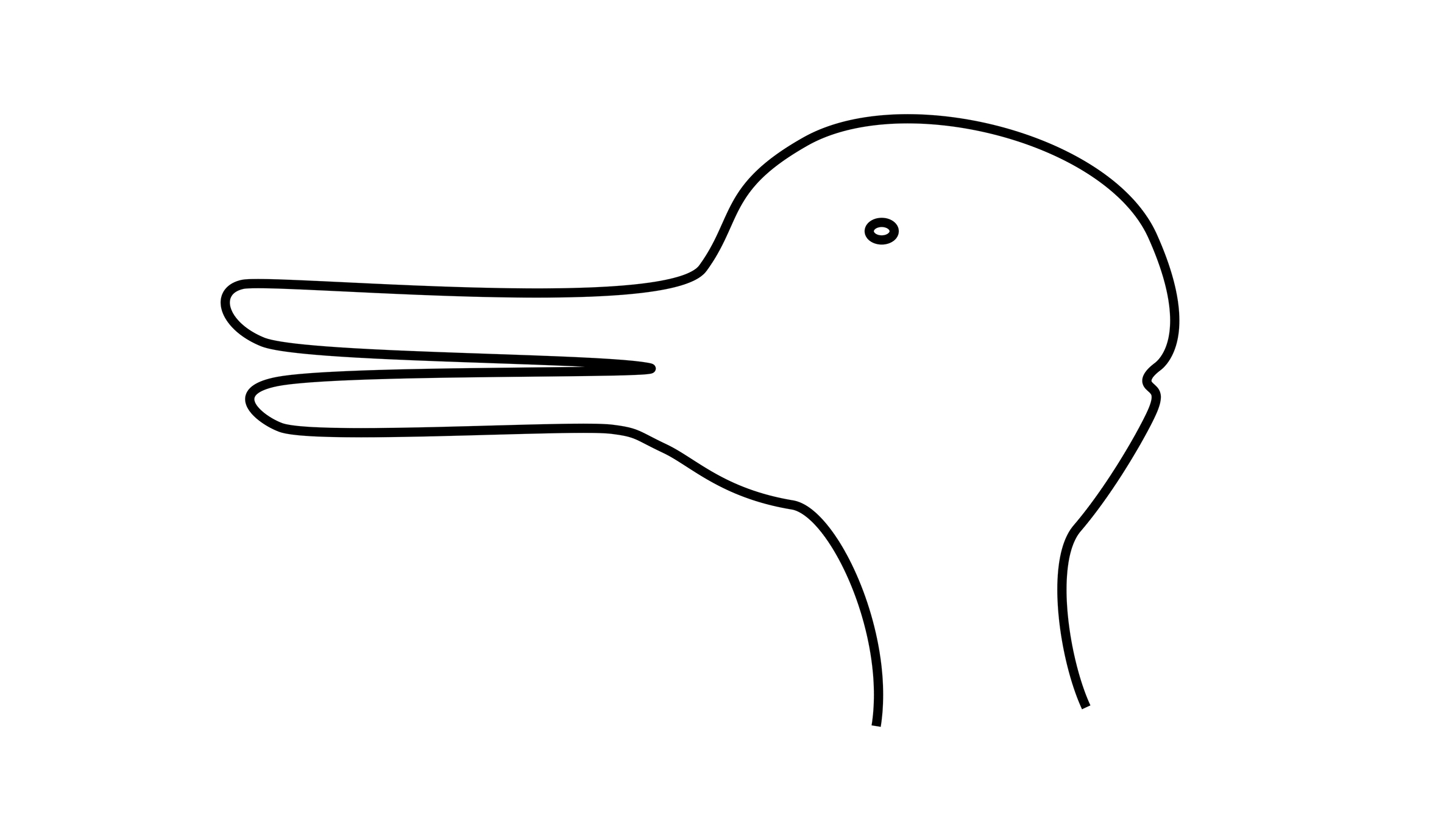
Philosophical interest in the classic reciprocal Duck-Rabbit image can be summarized as follows. First you perceive one animal, then the other, but your perception of the second is affected by having seen the first, then, looking back at the first again, your perception is further affected by having seen both. This third pamphlet follows the same triangular logic: a reconsideration of the first one’s “scientific” intentions with the second one’s “romantic” outcomes in mind, in order to draw a total gestalt. Or—to literally cannibalize its predecessors—this pamphlet assumes the contemporary forms of attitude, practice, and deconstruction, abiding Thierry de Duve’s survey of art school paradigms in the first pamphlet:

– towards these ends outlined in the second one:

In the first pamphlet, we considered what the (then) popular but woolly term “design thinking” might augur for art/design education by collaging some diverse (and largely incommensurate) characteristics suggested by a motley roster of writers. Since then, prompted by the free-ranging spirit of its successor, we happened across another inventory that feels both more timely and closer to home. In “A Cautious Prometheus,” a talk delivered to an audience of design historians, the contemporary French sociologist Bruno Latour reduces the particular “discipline” of design to five fundamentals:
Humility—that designing involves doubt, speculation, planning, sketching, iteration etc., rather than arrogant assertion;
Attention to detail—that all aspects are equally relevant and subject to scrutiny;
Semiotic capacity—that a design lends itself to interpretation;
State of flux—that to design something is really always to REdesign a previous version; and
Ethical implication—that any design essentially provokes the response “good” or “bad.”
Latour cites a pretty convincing real-world example as to why these qualities are particularly pertinent right now: the ecological crisis, with its chronic imperative to deal immediately, pragmatically, with hard practicalities rather than soft abstractions. Resolution is not an option here, only constant monitoring and perpetual repair. He further claims we have never been modern, meaning that the “official” critical project kick-started by the Enlightenment—that of Modernity in general, and by extension its Modernist arts wing in particular—was always fundamentally flawed. As long as we continue to proceed according to its myth of incremental progress towards perceived ideals—of absolute solutions governed by verifiable facts—Latour contends that any emancipatory ambition will remain fundamentally disabled: a lost cause. In one modest gesture towards “changing our way of changing,” he proposes a semantic shift from the hoary notion of progress to a more tentative progressive. Hence the nicely absurd image of a wary Prometheus as Latour’s designer mascot, cautiously sketching rather than heroically building. Our course, then, assumes a comparable demeanor—the stereotype of the well-adjusted Librarian squaring off against the gung-ho Bauhausler.
...
2
Here’s our point of view. Given that the Bauhaus was set up specifically in reaction to the particular social and cultural conditions of ±1920s Germany, why does its Foundation Course (“more or less amended, more or less debased,” according to De Duve) remain the default model in, say, ±2020s U.S.A.? If we reconsider what might constitute a good foundation today, initially ignoring the regular distinctions of both under- and postgraduate, and art and design, and at a necessary remove from the crippling bureaucracy that attends most schools in the early 21st century, what progressive form might it take?
The Bauhaus was a paternal model. To paraphrase a sentiment often ascribed to Lord Reith, one-time Director General of the BBC, it attempted to give the public not what it wanted, but what it ought to have—it knew what was best. From a position of intellectual authority, the school (like the BBC) determined what society required, and developed a fit-for-purpose plan of action in order to utilize industry towards constructive ends.
A century on, we might conclude that such top-down authority in the arts has been undermined by the bottom-up primacy of market demand; so much so, in fact, that the implied arrow of production has now surely reversed, from Industry-serves-Society to Market-dictates-Industry. It’s a crude generalization, but one we assume is broadly felt and widely acknowledged enough to reasonably guide our approach here. In line with this inversion, our instinct is to similarly work “the other way round.” Rather than the usual Promethean talk of a return to zero, launching an initiative from scratch, we’ll work backwards from the prevailing condition, retreating in order to observe and tinker with what’s already in place. We’re children of Deconstruction, after all.
...
3
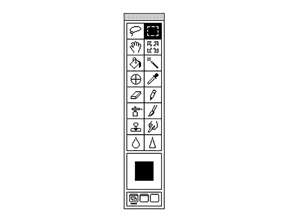
And here’s our frame of reference. Digital arts software exerts a fundamental influence on contemporary cultural work. The vast majority of anyone even vaguely touching art and design use the same few programs from the broad and ever-blurring set of disciplines such as fine art, graphic design, photography, writing, editing, etc.—or any of the alternative categories put forward by George Kubler (envelopes, sculpture, painting) or Norman Potter (things, places, messages) noted in the previous pamphlet. From the vantage of the contemporary art/design software, the formerly discrete parts are less important than the whole Creative Suite, a flattening abetted by the erosion of the amateur/professional divide.
Compared to the hard tools of the Bauhaus (whether colour wheel, paintbrush, camera, or planer), today’s soft simulations lack any significant distinction from one another: the paintbrush is the eyedropper is the eraser—one of a continuously expanding collection of pixel-modifiers, or effects. According to Tim Griffin (writing in Artforum), today’s digital “effect” effectively synthesizes its various etymological roots—a result; goods or moveable property; a mode or degree of operation on an object; the physical result of an action of force—to produce similarly indistinct hybrids of production & product, catalyst & consequence. Effects become ends in themselves: After Effects with no identifiable Befores. Fluency in this toolbox, then, disregards the technical proficiency of an earlier Bauhausian model and replaces it with a kind of forensic faculty. In place of “How can I do this?” the more useful question now is “What did I just do?”
We’re going to use one of the software monopolies, Adobe’s Creative Suite bundle, as shorthand for current arts software in general—and even more specifically, the “Photoshop toolbox” as a colloquial proxy. The advantage of CS in the face of other current contenders like Adobe Premiere, Microsoft Office or Final Cut Pro is that it usefully circumscribes the trickle-down effects of three formerly distinct domains (Photography, Drawing, Typography) in one compound package (Photoshop, Illustrator, InDesign)—a gamut already rich with implications. For instance, consider what Bauhaus DNA remains in these disciplinary updates (Effects? Vectors? Makeup?). What’s been gained and lost in this genealogy? Here’s some more precog from the other pamphlets:
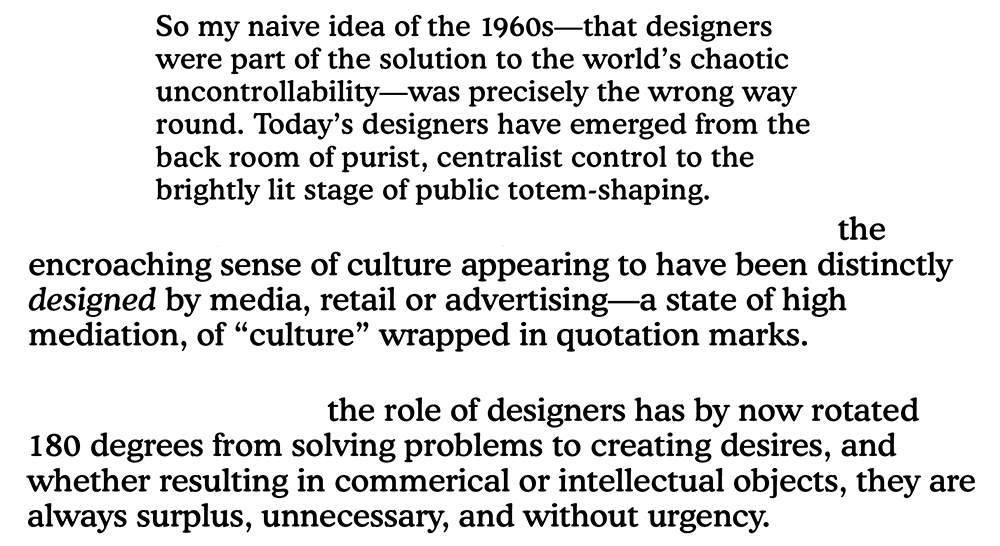
All of which suggests a wholesale shift from the construction of images and objects to their rote mediation; from depth to surface. How to reintroduce an ethical dimension in which the form is determined by the depth of engagement rather than an aggregate of expectation? If we accept that broad switch to Market-dictating-Industry, a package as entrenched in contemporary culture as CS must, by virtue of being a massively popular product, mirror the consensus of market demand—its “creative” components at any given point reflect the most wanted techniques. What exactly are these techniques, why have they prevailed, and what relation, if any, do they bear to their manual precedents? The aim is to navigate an education according to such questions, following a course guided by whatever seems intellectually and practically instructive in the commercial toolboxes of the time. Not in order to capitulate to market demand, naturally, but to interrogate its preferences; to query tools whose uses have become bland, unthinking; to work from the situation rather than towards it. The course as a whole, then (the container, the box) is itself a tool for thinking, as well as a means to prompt the use of that tool.
Lest all this might seem suspiciously abstract, arbitrary or absurd, it’s worth mentioning that the founding conceit here—reconceiving the Bauhaus Foundation Course via the Photoshop toolbox—is drawn from actual experience. A couple of years ago, a friend who’s a working artist was appointed to the full-time faculty of the Fine Art department in a major U.S. university, and one of her inaugural obligations was—surprise!—to teach an undergraduate class in Design. Such a situation isn’t untypical, and though the overarching causes are more or less obvious, it’s worth summarizing this one particular effect: a “teacher” “teaching” a subject she has never herself been taught, and has no particular involvement with or much interest in otherwise. The extent of any guidance was to be handed the couple of sheets that constituted her predecessor’s stab at a curriculum which comprised—surprise!—the Bauhaus Foundation Course: colour wheels, grayscales, circles, triangles, squares, more or less amended, more or less debased. And so: “[exasperated] you know [sigh] it would probably be more useful to teach the kids by [sigh] going through the components of the fucking Photoshop toolbox …”
...
4
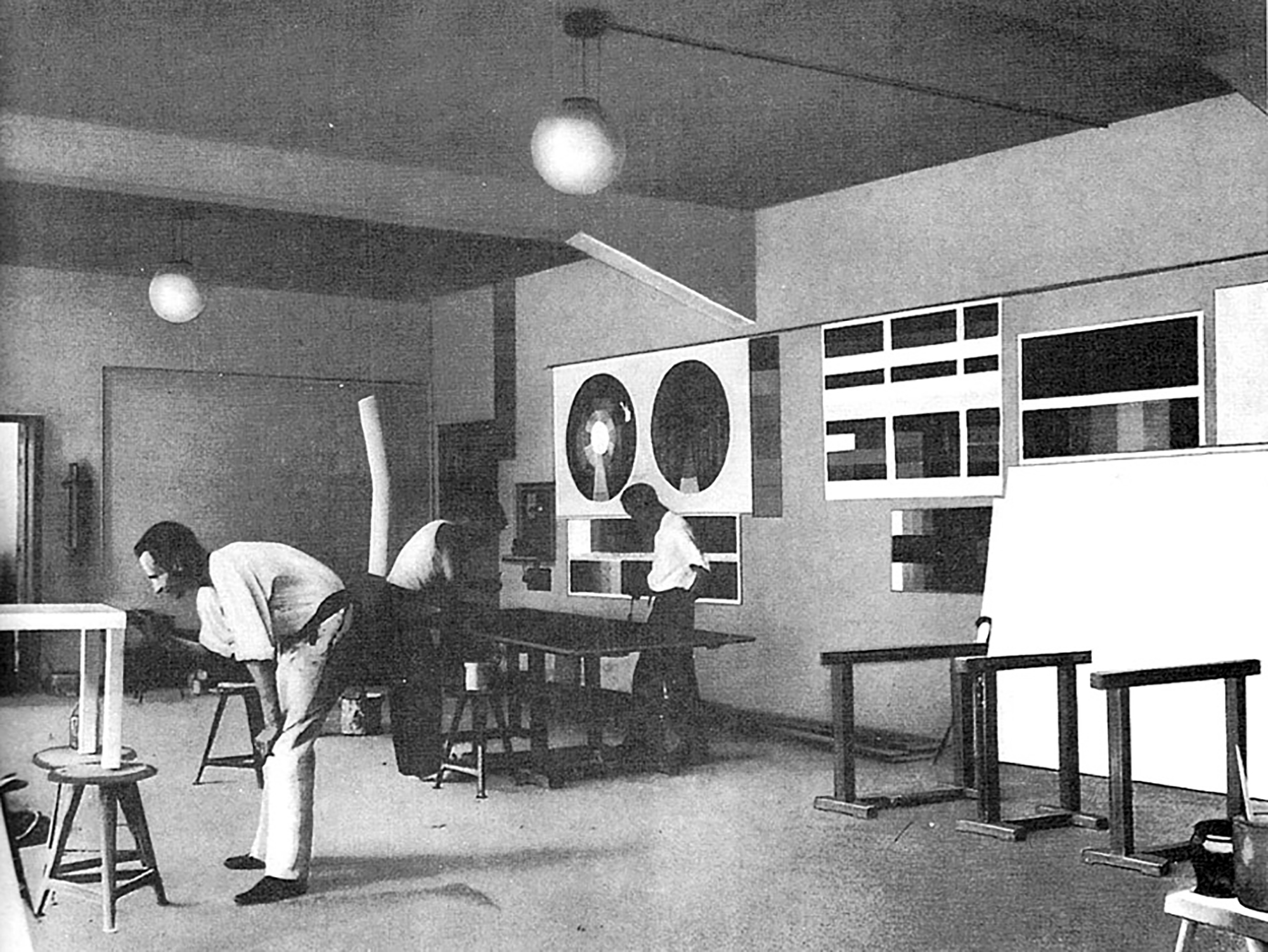
Aside from the reconsideration of its tools, the box metaphor was prompted by three other frequently recurring art school disillusions. One is the demise of the inclination and ability—a downward spiral—of students to articulate their own or others’ work, especially in a group. A second—surely an outcome of the first—is the demise of both the inclination and ability to consider such work relative to culture at large. And a third is the absence of shared intentions, of staff and students working towards perceived, declared ends (however abstract or diverse): a sense of who is teaching what (and why and how) in relation to everyone else. In short, how the parts fit together to form a construcive whole.
So: literally for the sake of argument, our initial contention—or suspicion—is that colour wheels and other principal features of “basic design” are today less constructive than a communal effort to observe and relate the contemporary condition by practicing the forms of reading, writing, and speaking that facilitate its articulation. The most appropriate foundation we can imagine right now is one that fosters the inclination and ability to participate—to articulate current social and cultural phenomena as a group in order to work parallel to them individually. And aside from its ready stock of metaphorical tools, our cartoon toolbox icon is also handy in constituting a readymade framework—a matrix that shows that sum as well as the parts, an image that can be held in mind by the entire “department.” Ditching the specificity of Photoshop or even CS, then, we’ll begin only with this nominal idea of the toolbox—an outline—and customize our own hybrid with bits from various domains and softwares along the way.
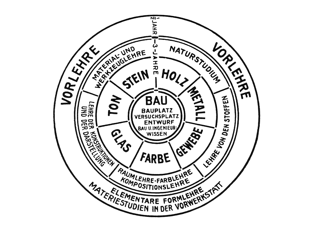
We’re clearly not interested in “teaching the tools” so much as trying to defamiliarize them, to make them as strange as we suspect they actually are. And so we’ll start with a handle—a carrier—then clip on new components as and when they’re abstracted into a teaching class, forming an expandable and adaptable diagram rather than the locked-in panopticon of Johannes Itten’s Bauhaus schematic. In fact, flip back to that Bauhaus onion for a moment, with its progression through layers of years towards a final imperative: BUILD. With Prometheus in mind again, what might it mean to invert the metaphor, starting from the inside and designing our way out—asking why as well as how? Because the idea of this course is that it works itself out in practice, that this process itself constitutes part of its “teaching.” In this first installment, we’ll necessarily start with those components that allude to more general, structural “skills.” Meaning the hand, pointer or lasso rather than pencil, brush or knife—those already a degree of metaphorical remove beyond that of the more obvious artistic tools. As time goes on, this priority ought to switch to become more materially grounded.
...
5
Last summer I took part in a two-week temporary academy in the company of a dozen youngish artists and a faculty that comprised a painter, a collagist, a writer, a designer, a poet, and a Greek philosopher. The overarching theme of the fortnight, titled When your Lips are my Ears, our Bodies become Radios—attuned to national identity and group activity—was played out through a kind of extreme sports version of a weekly workshop. The group had arranged to submit three pieces of work each day to be channeled through three local media formats: a meter-high poster displayed on dedicated columns around town, a 10-minute audio segment aired on a community radio station, and a certain number of column inches in the local newspaper. This incessant production was deliberately designed to force the sort of abstract discussion we might expect from the group art seminar into concrete, public, “answerable” forms. Because the matters arising had to be more or less immediately communicated to an external audience, they were forced through a high-pressure mangle of translation. In the process, the issues discussed during the day were actively handled and immediately channeled.
Then last month I attended a two-day conference on French philosopher Jacques Rancière titled Everything is in Everything after the motto of Joseph Jacotot, the quietly radical eighteenth-century pedagog and subject of Rancière’s The Ignorant Schoolmaster. I’ve already recounted, in a lengthy postscript to the previous pamphlet, how that book sums up and now informs our attitude here, but to briefly recap in the terms that dominated this event: Rancière, speaking for and through Jacotot, posits a “horizontal” egalitarian pedagogy against a “vertical” hierarchical one. In the traditional vertical model, an authoritative master typically stultifies by dispensing knowledge piecemeal, progressing step by step towards a complete intelligence, while in Rancière’s horizontal alternative, the “ignorant” master emancipates by insisting that intelligence is the precondition of learning rather than its goal. In this formulation the student essentially teaches him- or herself, while the “master” creates the conditions for this to occur by providing articulate objects (a book or other device) that will “reveal an intelligence to itself.”
What struck me at the conference, though, was how the principles being espoused and debated were unwittingly enacted by the presentations themselves. It became increasingly difficult, in fact, to pay attention without reflexively evaluating to what extent the various speakers were acting in line with their subject, i.e. whether they were behaving like an explicating authority or a fellow ignorant. The social implications of Rancière’s thinking were also manifest in the more mundane aspects of conference decorum: speakers overrunning their slots, panel discussions without discussion, opaque academic jargon, and sundry opinions and mannerisms that seemed suddenly heightened either in accord or at odds with Rancière’s teaching. The net effect was a kind of meta-conference in addition to the ostensible one, which merely demonstrated the difficulty of putting principles into practice even if you wholeheartedly adhere to them in theory. But the point remains: Rancière’s writing is carefully contrived to prise the reader—or proselytizer—out of inertia and into action, impelled to practice what’s being preached.
And the other week I went to a two-hour talk, On (Surplus) Value in Art, by a well-regarded cultural theorist at a local art school. He began by briefly describing the two fundamental Marxist notions of value—“use” and “exchange”—in order to consider whether, in light of social and cultural developments since Marx’s time, it’s possible to conceive other types of value outside this binary distinction. The rest of the lecture comprised a number of suggestions, nicely prefaced (and summed up) by the notion of “whistling in the shower” as representing the sort of romantic activity that occurs outside our normal conceptions of time spent productively. While the examples presented in the talk involved situations or objects that carried these alternative values, considering this idea from a user’s or observer’s perspective, most of the students’ questions afterwards—which lasted as long as the talk itself—wondered what it might mean to produce according to this dissident ethos, to make things not primarily instrumental or profitable. As it turned out, the talk was merely a set-up for a group discussion the following day, dedicated to precisely this question.
The exaggerrated workshop that forces abstract into concrete; the auto-implication of Rancière’s horizontal idealism, student and teacher together investigating a strangely articulate object; and the thought experiment that unhinges now in relation to the recent past: these three encounters strike us as exemplary working models, ways in which our course might play out in terms of practical projects.
...
6
Our toolbox will be housed within the larger environment of a newly-minted not-for-profit umbrella institution, The Serving Library (and stored behind the bar). The Library consists in two complementary spaces, virtual and actual. The former (www.servinglibrary.org) is a depository of freely downloadable PDFs—or “bulletins”—assembled bi-annually in themed batches to serve as a rough semester’s worth of reading matter. The latter (currently a mobile library, but on its way to a fixed location) comprises two collections—of books and artefacts—both derived from 10 years and 20 issues of our house journal, previously known as Dot Dot Dot, now superseded by a bi-annual hard copy of the PDFs called Bulletins of The Serving Library. These two collections will continue to grow as each issue of the Bulletins suggests a new round of books and artefacts to scavenge.
The books are shelved according to a simple binary: either (0) older, “classic,” most-frequently-referred-to works of, e.g., literature (Musil’s The Man Without Qualities), cultural studies (Bracewell’s The Nineties), philosophy (Kierkegaard’s Either/Or), and, typically, all three combined (Pirsig’s Zen and the Art of Motorcycle Maintenance); or (1) newer publications that passed through—and were often published by—our workshop/bookstore Dexter Sinister in New York, which was essentially the prototype of the library back when we were more preoccupied with selling than archiving. One way to relate these two types of books is to say the new ones are directly marked by the spirit of the old zeros; another is to level them into a single collection by way of hardback library leatherette.
The artefacts are mostly flat, framed, and hung in the haphazard manner of the assorted junk that hides the fading wallpaper in old British pubs. They are wildly diverse in size and medium, from a huge red wax crayon rubbing of a Monument to Cooperation (the original relief fronts a housing estate around the corner from Dexter Sinister) to a modest update headed Monument to Information on an enamel plaque. Other objects include paintings, lithographs, woodcuts, polaroids, record covers, and LSD blotter art. And because each one originally appeared, scanned or photographed, as an illustration in an issue of Dot Dot Dot or one of the Bulletins, they come with more or less elaborate backstories in tow—useful items to point at during a seminar.
Both books and artefacts are cooperative collections in two senses. First, that they constitute the pooled resources, influences, and enthusiasms of a relatively large group of writers (say, 100 people) over a relatively long period of time (about 10 years). Second, that they have been sought, swapped and bought, bound and framed, courtesy of a number of sympathetic institutions over the past few years (thanks again!) as and when germinal versions of the Library were staged in various corners of Europe. During our course, the idea is to freely draw on both books and artefacts. Mid-seminar, I might recall something, run to the shelf, grab one of the “past” books—say Pirsig’s Zen, again—, spend five minutes trying to find the page, then read:
The result is rather typical of modern technology, an overall dullness of appearance so depressing that it must be overlaid with a veneer of “style” to make it acceptable. And that, to anyone who is sensitive to romantic Quality, just makes it all the worse. Now it’s not just depressingly dull, it’s also phony. Put the two together and you get a pretty accurate description of modern American technology: stylized cars and stylized outboard motors and stylized typewriters and stylized clothes. Stylized refrigerators filled with stylized food in stylized kitchens in stylized houses. Plastic stylized toys for stylized children who at Christmas and birthdays are in style with their stylish parents. You have to be awfully stylish yourself not to get sick of it once in a while. It’s the style that gets you; technological ugliness syruped over with romantic phoniness in an effort to produce beauty and profit by people who, though stylish, don’t know where to start because no one has ever told them there’s such a thing as Quality in this world and it’s real, not style. Quality isn’t something you lay on top of subjects and objects like tinsel on a Christmas tree. Real Quality must be the source of the subjects and objects, the cone from which the tree must start.
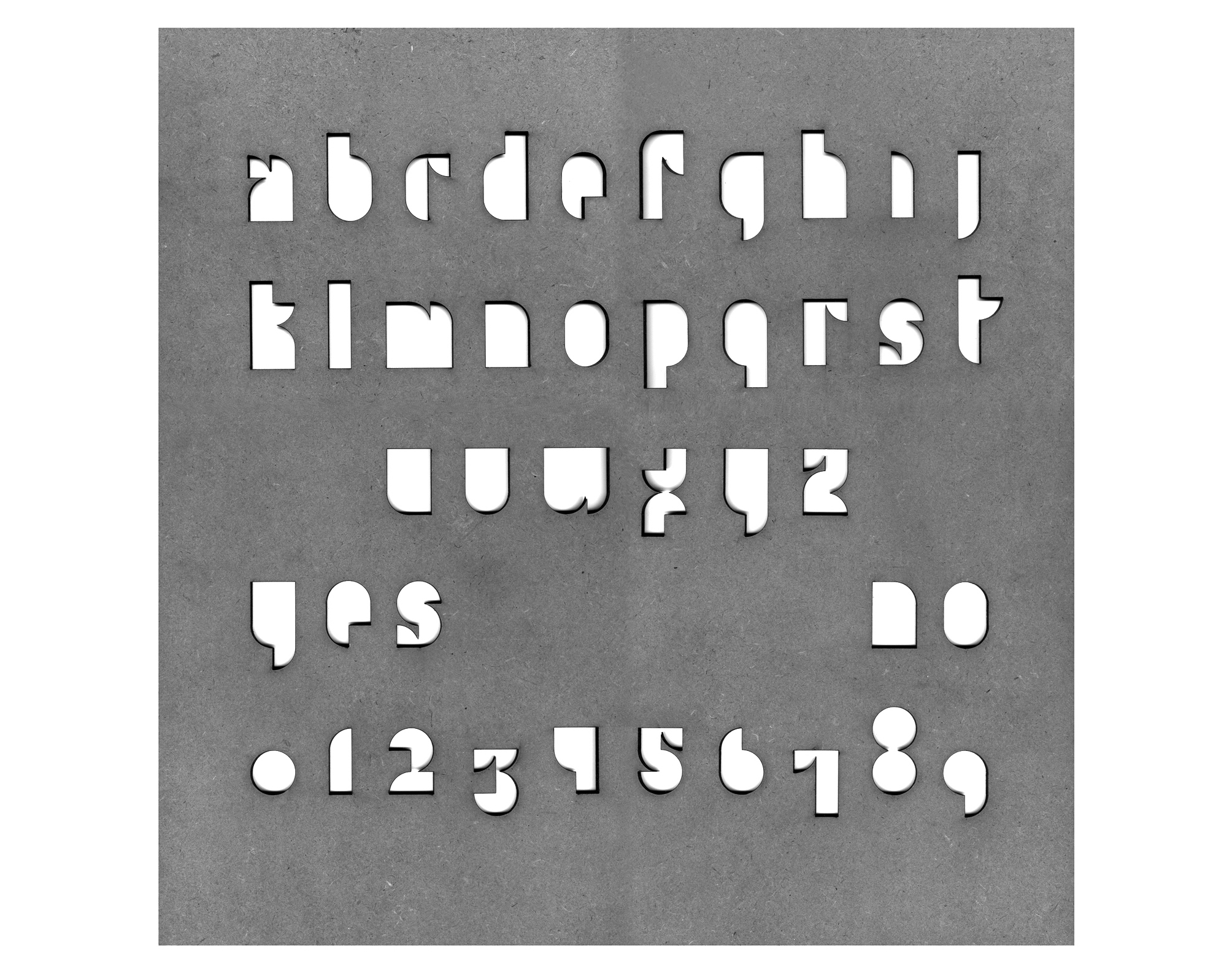
… or might point to the square object with the stencil alphabet and explain that it’s a ouija board made by Paul Elliman while a design professor at Yale a decade or so ago in order to engage Josef and Anni Albers in a séance with his class; that it utilizes a version of Josef’s modular geometrical typeface to render A–Z, 0–9, a “yes” and a “no,” laser-cut from one of the three proportional formats, and in the same material—hardboard—used for his well-known series of colour paintings.
… or might refer to one of the “present” books—say, the essay collection Notes for an Art School, and show how all aspects of its material form—size, colours, paper, margins—were directly drawn from the very particular restrictions of the eccentric printing machine that produced it; and relate this to the historically-organic form of the oujia board; and oppose these to the kind of surface style lamented by Pirsig; and onto a discussion about the relative presence and value of both today in art, in society, and so on. All of which ought to occupy a morning, at least.
...
We’ve been missing a shared goal for some time now—to establish a plan as concerted as a Bauhaus mandate, bearing in mind the lessons of such previous experiments and the cultural changes since. We intend to assemble a bunch of tangible skills (critical faculties, orienting attitudes, whatever) relevant to working right now. Not in reaction or capitulation, but more as a means of staying awake, alert, concerned, committed. It should be apparent that this is a hard surface with a soft centre—a structure with no curriculum. As ever, it’s a case of trying to establish and maintain an equilibrium of freedom and order; careful to ensure that “letting things work themselves out” doesn’t morph into an excuse for letting original intentions slide.
Here’s how we imagine all this working. We’ll invite guests from different fields to come and help deconstruct their respective digital toolboxes by isolating a component in order to consider, together with the class, its analogue past, virtual present, and possible future. The “past” aspect will consider the lineage of the tool in question as a physical object or process, whether prosaic (type), allusive (hand) or madcap (magic wand). The “present” will consider its digital corollary, whether a direct translation of an analogue technique, a more complex metaphorical interpretation, an effect that has superseded its physical referent, or an autonomous function with no ostensible counterpart. And the “future” will, of course, be pure speculation—science fiction—according to the whim of the teacher’s particular ignorance.
In response to the closing question, “Are you an idealist?,” in a recent interview, the Danish art critic Lars Bang Larsen replied:
The question remains, how to combine idealism with the scepticism and self-reflection that turns it into an artistic tool rather than an end in itself?
In which case, this prospectus will ideally serve as a kind of all-purpose wrench.
*
The Banff Centre, Summer 2011
Visual Arts, July 4 – August 12
David Reinfurt
Stuart Bailey
Anthony Huberman
Robert Snowden
Angie Keefer
Junior Aspirin Records
Rob Giampietro
Group seminars will take place each weekday morning within the model of the library that we’ll assemble together in the Walter Phillips Gallery during the first week.
WEEK 1:
Introductions, library assembly, exhibition opening.
WEEK 2:

The T here stands here not just for TYPE, but rather for its mother discipline Typography, or how words are written into the world. Typography isn’t only concerned with typefaces, traditions, or technical methods; it more broadly describes how an idea that takes abstract shape in the mind is transposed—via language—into the concrete world. If language is the looking glass that constructs our thinking, typography is the crucible where the Platonic essence of an idea meets its William Jamesian actualization.
Have you ever watched a 5-year-old learning to write? First, draw a mountain, up-up-up. Stop. Now back down-down-down. Stop. Next, draw a line right across the middle, from this side to that side. Perfect: an “A.” Then, as the child makes her way through the rest of the alphabet, practicing and practicing, she is at the same time also learning to recognize and to read. And as she moves from drawing to writing, it’s as if the mechanick exercise of moving her hand to make these strange marks literally draws the glyphs closer. Reading and writing are fused in a mechanical-cerebral alliance whose alchemical result is typography. I’m reading and writing right now.
“Pure” information is a misnomer. Every transmitted idea must be carried in a container. And that container inevitably asserts itself back onto the idea it contains. John Cage put it simply:
It is like a glass of milk.
You need the glass, and you need the milk.
In order to think about typography, together we’ll perform a series of simple exercises designed to recover the essential strangeness of our alphabet by following typographic assign-ments from Paul Elliman, Bruno Munari, Robert Bringhurst, Dennis Oppenheim (and son), Oliver Sacks, Beatrice Warde, and Donald Knuth. (DR)
WEEK 3:

The LASSO is loosely appropriated here as a device that captures a moving object (in its analogue sense) or an irregular one (in its digital sense)—in our case, “the cultural condition.” Brian Eno draws a capital distinction between “culture” (imperative) and “Culture” (gratuitous), and this class is concerned with the former—which is to say society in general rather than art in particular. Together we’ll attempt to grasp its dominant characteristics, such as these three I happened across the other day in a book review: The corporatized society … The post-natural environment … The pharmacologically-altered human landscape. To bring us up to speed we’ll consider some previous attempts both distant and recent, including those of Henry Adams (1907), Umberto Eco (1962), Michael Bracewell (2001), Mark Fisher (2009), and James Gleick (2011).
Bruno Latour has recently called for a shift from thinking in terms of “matters of fact” to “matters of concern”—away from the limited perception of self-contained phenomena, and towards the fullest possible scenography of hybrids, connections and networks. He then asks, “What is the style of matters of concern?,” i.e., how might we model them in order to get a grip (if not exactly reign them in)? Past examples of visual representation, such as perspective drawing, projective geometry, CAD imaging, Google Earth, he claims, come nowhere near capturing the essence of current processes.
The practical part of our class will respond to Latour’s question, attempting to model key features of our culture’s near past and near future—the continuous present—in a manner appropriate to it. Threatening for the effects. What form might this take, bearing in mind the same knot used for a lasso also makes a noose? (SB)
WEEK 4:

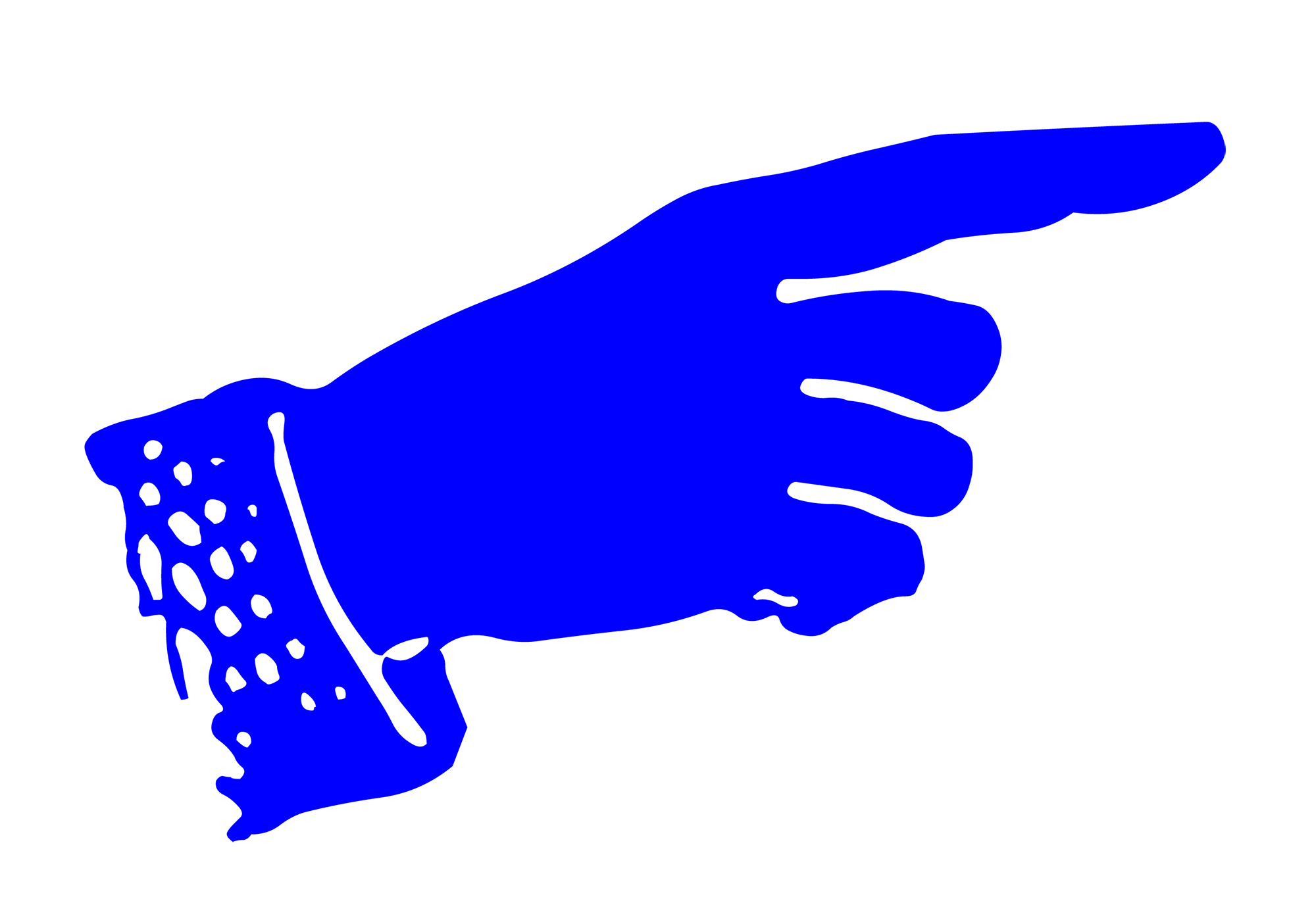
Some say that it’s rude to POINT. But to select is far more so. A common misconception about curating is that it’s about selecting artworks, when, in fact, it’s about finding them, pointing to them, and moving them elsewhere—literally, poetically, conceptually, and carefully.
Much of the difficulty with making an exhibition lies in the fact that to select and extract something from circulation—an object, image, practice, or idea—and stop it, examine it, and exhibit it, is to do it a great injustice. A range of writers have recently been discussing the life of things, referring, in the largest sense, to all that which is usually not considered to be cognizant human subjects: objects, pictures, rocks, animals, natural systems, etc. These things—objects, images, and ideas included—have their own agency and won’t simply sit still under someone else’s microscope, on someone else’s terms. In fact, what makes them compelling is precisely what animates them, what they want, and where they go when they are set loose into the world. In other words, objects, images, and ideas have lives to live, and instead of selecting them, explaining them, and using them to prove a curatorial argument, let’s try something far more respectful, affective, and generative: use your pointer, raise your glass, and give a toast.
We’ll have the things on the walls of The Serving Library and the spirit of Fischli & Weiss as our guides, and we’ll see where that takes us. In other words, the opening of our exhibition will mark the beginning of our curatorial idea, not its end. (AH)
WEEK 5:

We call anything functional, from software to ideas, a tool. This flex is recent. In antebellum America the word “tool” denoted an implement that could make one thing at a time. Reconstruction-era industrialization broadened the meaning of the word to include any implement involved in the manufacture of a product, which necessitated the coinage “hand tool” to distinguish traditional implements from what came to be known as machines. The difference between these two mechanical species, it seems to me, may be more a matter of culture than of engineering. Machines are both the rival and the antithesis of humanity. In their complexity they resemble us. In their simplicity (all those moving parts, and yet no Oedipus complex, no fear of death, no ecstasy), they are as William Blake put it, “satanic.” Machines are largely autonomous and threaten us with obsolescence, whereas a tool is nothing without us. Depending on how technologically deterministic you like to get, a computer is either a tool on its way to becoming a machine or just a machine. And software like Adobe Photoshop is a tool comprised of lots of smaller, more specialized, interworking tools like the CROP Tool.
Left column. Third from the top. The icon resembling the annoying way photographers mime their hands up into a frame and move it around whenever the muse comes calling. It allows you to select an area of an image and discard everything outside this area—a sloppy tool for really basic needs. I’ve used it only once, while expunging Uncle Doug’s third wife from a photo he wanted to frame for his newish girlfriend.
Michel Foucault argued that man is essentially a thinking animal who lives in a world that is intelligible to him only because he imposes his own order upon his experiences. When asked to teach a Photoshop Tool at a temporary school inside an art institution in the middle of the woods in Canada, I thought that considering Foucault’s term Heterotopia would be a way for us to get naked about being in such a clean, well lit place. The term comes from a lecture he gave in 1967:
There are also, probably in every culture, in every civilization, real places—places that do exist and that are formed in the very founding of society—which are something like counter-sites, a kind of effectively enacted utopia in which the real sites, all the other real sites that can be found within the culture, are simultaneously represented, contested, and inverted. Places of this kind are outside of all places, even though it may be possible to indicate their location in reality. Because these places are absolutely different from all the sites that they reflect and speak about, I shall call them, by way of contrast to utopias, heterotopias.
A heterotopia is, then, a kind of manicured environment, anywhere where you feel like you are inside a big set of parentheses, an enclosed theater of human folly, aspiration, and formation. Practically, this class will involve a lot of reading (which is, of course, it’s own set of parenthesis) and talking about reading. What we read will be based on examples of the term, and our present digs: The Library. The Campus. The Cruise Ship. (RS)
WEEK 6:

The SPINNING PINWHEEL—and its other incarnations: the tumbling hourglass, the cycling wristwatch, the progress bar —isn’t an implement, it’s a show. It appears intermittently, without warning, to signal a state of preoccupation, so that you, who were formerly in charge, but are now temporarily relegated to the audience, may be gently assured that any further inputs will be moot until the spinning wheel fulfills its distractive function, then disappears, whereupon the simulation of your tool-wielding agency may re-commence. If there is one element in the digital software user experience that cannot be avoided, this is it; you will encounter the pinwheel and its ilk. They are meant to persuade you that your computer is taking a moment to think.
This class will concern presentation, working from the assumption that how we talk about whatever it is we do, is an integral part of doing it, and therefore, whenever we attempt to talk about, we are inevitably talking within. Rather than spinning our wheels—dissociating talking from doing, thinking from making, and seeming from being—we’ll consider the potential for more usefully associative models of showing, telling, observing and listening.
As a background for our class activity, we will refer to talks given by Ludwig Wittgenstein and Vladimir Nabokov, concerning indefensible statements of wonder, including that familiar standby of the artist’s repertoire: “Lately, I’ve been interested in …” (AK)
Plus, on WEDNESDAY EVENINGS:

Just as it’s important to know how to read, write, speak and do, we all need to know how to listen. (What are hands for, if not to hide the eyes?) With those ubiquitous white headphone leads dangling from our ears as we walk the streets and ride the subway, today we’re plugged in and listening in ways unimaginable even a decade ago. Compact discs are now more commonly used as drinks coasters and vinyl records survive mainly as connoisseur collectibles; recorded sound has shed its corporeal form and new structures of listening have evolved. We scroll through hours of recordings using the progress bar in iTunes, dipping in and out of songs, symphonies or audio books. We shuffle through manifold musical genres and decades, and share our discoveries with friends and like-minds.
These new structures of listening may have things to tell us about the way we produce and consume culture. How is narrative created? What does our ability to access, at the click of a mouse, almost any album or film that’s ever been made tell us about taste, consumption and how we construct our idea of history and progress? If all that is solid really has melted into air, what of the materiality of the hardware we use in order to be “connected”? (That immaterial digital code needs to get to us somehow or other.) How does listening affect the ways we relate to each other, make things or exchange information? Four sessions of AUDIO ANNOTATION (in the dark) will ask us to use our ears in order to see things a little differently. (JAR)
Finally, at some point in the middle of the Foundation Course, Rob Giampietro will deliver a remote lecture on the HANDLE:

*
References:
In the hope of helping the text flow a bit better I decided not to foot- or endnote the many books and articles cited in the texts, but all the relevant references are finally collected here.
Abu ElDahab, Mai, Florian Waldvogel & Anton Vidokle, eds., Notes for an Art School (Nicosia: Dexter Sinister, 2006)
Diederichsen, Diedrich, On (Surplus) Value in Art (Berlin: Sternberg, 2008)
Griffin, Tim, “The Personal Effects of Seth Price,” Artforum (Summer 2008)
Larsen, Lars Bang, “Art is Norm,” Internationalistisk Ideale, no. 3 (2010)
Latour, Bruno, “A Cautious Prometheus,” www.bruno-latour.fr
Latour, Bruno, We Have Never Been Modern [French, 1991] (Cambridge: Harvard, 1993)
Pirsig, Robert M., Zen and the Art of Motorcycle Maintenance (New York: William Morrow, 1974)
Rancière, Jacques, The Ignorant Schoolmaster (Stanford University Press, 1991)
Sennett, Richard, The Craftsman (New Haven: Yale University Press, 2008)
Verwoert, Jan, Tell Me What You Want, What You Really Really Want (Berlin: Sternberg, 2010)
